Comcast Business
Project Role
- Led user experience for the redesign of a user management portal, combining a number of disparate systems into a single, unified experience for creating and managing users across all platforms in the Comcast Business ecosystem.
- Worked with internal stakeholders across Comcast Business to develop project requirements, understand technical constraints and create project buy-in.
- Designed user flows, wireframes and additional documentation for creating and managing user profiles and permissions, as well as a user directory.
- Collaborated with visual designers and developers to ensure that all designs and functionality made it into the finished product.
Problem
Comcast Business launched an internal project to modernize their digital experience, creating a cohesive experience for users to manage their services, pay their bills and receive support. Previously these experiences had been designed and developed piecemeal with different services (high-speed internet, phone plans, business TV, etc.) having their own sites and systems for handling these tasks.
A key component of the project was creating a new user management portal. Comcast wanted a single, unified experience for accessing user profiles across all platform in their ecosystem, as well as providing managers the ability to make all role and product assignments within the initial user creation flow. The portal needed to scale for all of their customers, from small and medium sized businesses with one or two locations and a handful of employees to enterprise businesses with multiple location and large hierarchies. This entailed creating the following;
1.
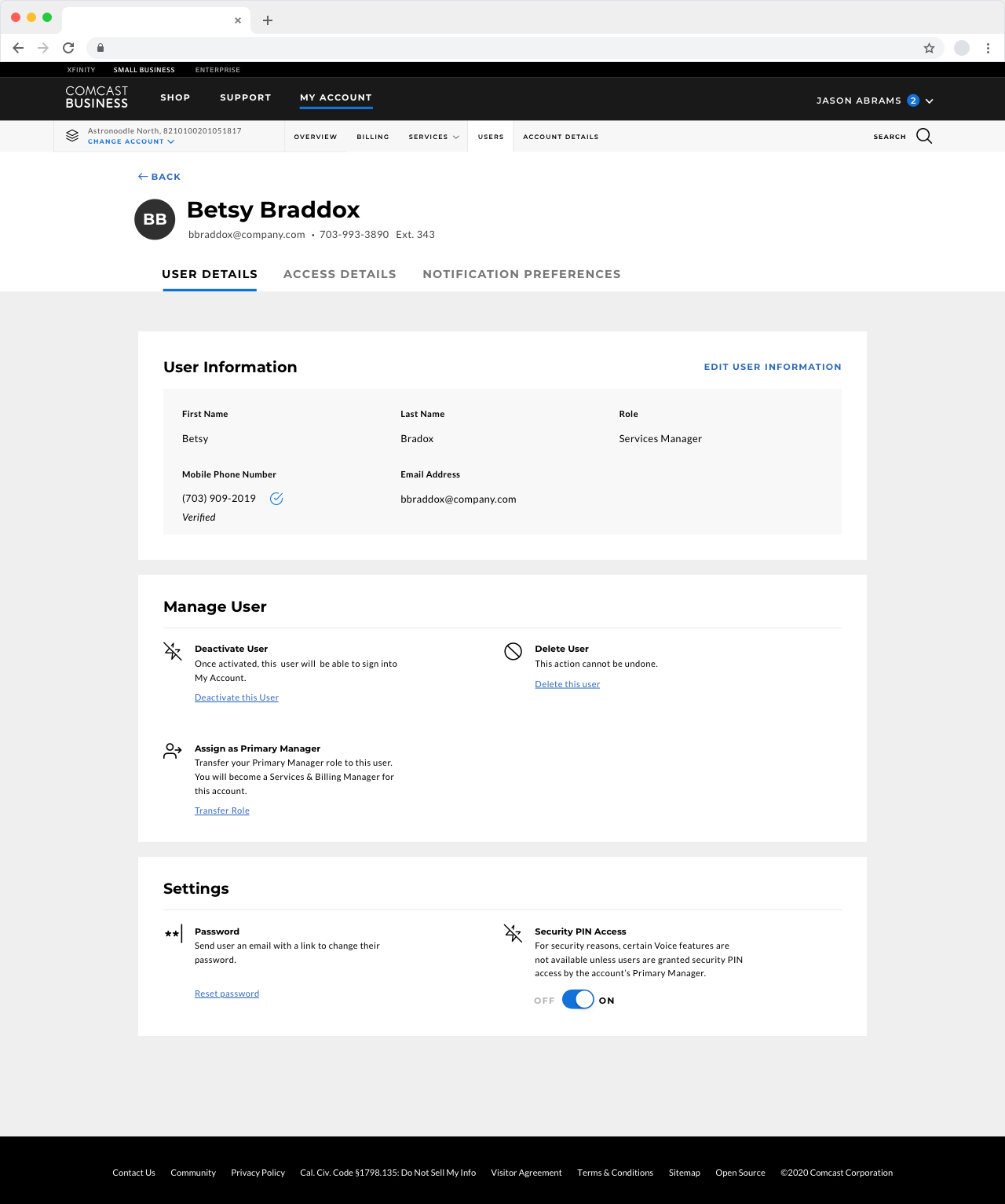
A User Profile for displaying contact information and adjusting settings. This needed to be flexible for a variety of user roles (primary manager, service manager, billing manager, general user) and products, as well as change based on who was viewing the profile (i.e. a user viewing their own profile versus viewing someone else’s).
2.
A flexible User Creation flow for primary managers to create and edit new users, allowing them to assign them to different products, set their role for each one and change any preferences.
3.
A User Directory that allowed users to search for other users in the organization, displaying their role and contact information.
Design Process
Evaluate Current System & Develop Requirements
The first step was evaluating Comcast’s current approach. I met with team leaders from each of the five products to discuss their existing user profiles and creation flows, gathering requirements for each and learning what they thought was and wasn’t working with them. From these discussions I created a number of UX deliverables in order to confirm requirements with product teams before moving onto the design phase. With no central authority on all the products, it was critical to build out all of this documentation in order to keep everything straight.
For the user profile, I built out a role matrix, which charted all of the potential sections/settings in a user profile and which would be visible or hidden depending on the level of user that was viewing the profile (i.e. what settings could a billing manager see and adjust when they visited a regular user’s profile).
For user creation/editing, I built over 30 task flows illustrating every step necessary for creating new users in each product and at every role level (service manager, billing manager, product user), as well as the steps necessary for editing any settings after creation (i.e. changing their role, deactivating their account, updating security settings, etc.).
to create new voice service users and managers.
Wireframe Design
With users being having access to up to six different products and being assigned one of three roles for each of them, User Profiles needed a flexible design system that would look great no matter the size.

Content was organized into three tabs; user details (personal information, security settings, role/product settings), access details (accounts/corporate locations that are assigned to a user) and notification preferences. Within the page, I used a card-based approach, giving each product and group of settings (personal information, security, etc.) their own card that could be included as needed.
Through large titles and plain language copy, I wanted to make the pages easy to scan and to understand the settings that were available. Users may not visit user profiles frequently, so it needed to be obvious how to take action. If possible, I wanted users to be able to change settings without having to leave the page.
In the case of more complicated settings, I created a template for full screen flow that could adapt to anything from creating or editing a user to changing a password or setting up two-factor authentication.
A timeline at the top of the screen let users know where they where they were in the progression and how many more steps they had left. If necessary, the steps could be added to the flow depending on selections that users made (i.e. when creating a new user, a manager could select the products they wanted to give a user access to, which would add additional steps to the flow). This design provided a great deal of flexibility, allowing for any type of input method. In total, this design allowed me to build out over 50 different flows for creating and editing users, setting up access to all products and setting up and modifying security settings.
Challenges
As the project progressed, it had to be rescaled due to technical and business considerations. The client didn’t want to wait until their backend systems were ready for a truly unified experience, so multiple revisions were made to create scaled back versions (for example, a version meant specifically for customers with voice services) that could be implemented until then. In addition to paring down the offerings, it required thinking about how the new system could live in tandem with the current system and creating a way for users to jump between the two.