BRILINTA.com Redesign
Project Role
- Analyzed previous website to determine what was working and what could be improved
- Reorganized the site's content to better fit both the user's and client's needs
- Created wireframes for desktop and mobile approaches
- Developed clickable desktop and mobile prototypes for use during remote user testing
- Developed a script and questionnaire for user testing
Design Process
Evaluate Existing Site
The first step was to analyze and pick apart BRILINTA’s current site to understand what was already being done. Pretty quickly it was clear that there were a few design inconsistencies that led to a confusing experience:
1.
Inconsistent Page Navigation - Certain content categories were organized into separate pages, while others were a single page with anchor links, not allowing users to create a mental model for browsing the site. Additionally, titles in the navigation didn’t always match the headlines on the page, making users unsure if they were in the right place.
2.
Poor Page Readability - Individual pages had poor type hierarchy, very little white space and an inconsistent color scheme, making it difficult to scan the page and comprehend what was on the page.
For any site, these would be huge red flags, but for a healthcare site even more so. BRILINTA is intended for people who have had already had a heart attack and are trying to prevent another one. For patients and their families, this is obviously a stressful situation. Patients, male ones in particular, will often put off or quickly quit research because of this. A clean and clear design that doesn’t give user’s an excuse to quit is a must.
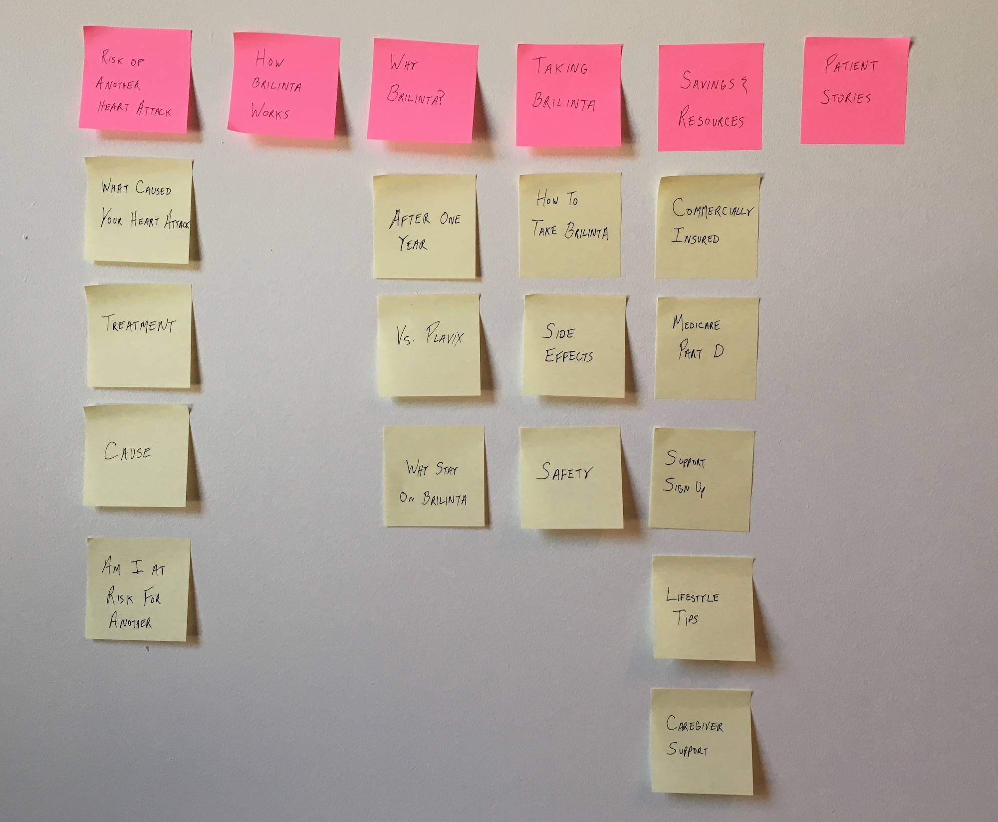
Content Reorganization
The existing site’s navigation titles were confusing and didn’t seem to be geared towards a user’s priorities. Patients are focused on the what/why/how of a treatment and content should be organized into sections that clearly explain that. I compiled a complete set of content for the new site by combining a content audit of the existing site with additions from the copy team. I then reorganized the content into sections centered around the questions that users would be asking about BRILINTA ("why take BRILINTA?", "how does it work?", "how do I take it?").
Wireframe Design
I wanted to make sure that the home page properly introduced BRILINTA to users, as many potential patients find the site through SEO. The existing site was confusing and didn't make it clear what and who BRILINTA treated. Each of the options I designed featured a clear set of calls to action that highlighted pages that focused on user's highest priorities (what is BRILINTA?, how to pay for it and how to ask my doctor about it). The three designs below were the ones that made into user testing.

A large hero image with three calls to action underneath

Two of the CTAs are pulled into the hero space, giving higher priority to those two pages

The CTAs are stacked on top of each other underneath the hero space, giving them more space to provide information, but requiring users to scroll to see all of them.
For content pages, all of my designs placed a premium on readability and scannability, with an emphasis on large headlines, content sections that were clearly delineated from one another, and lots of white space.
Eventually I narrowed the designs down to two template concepts that were developed into prototypes for testing:

A single scrolling page with multiple pieces of related content, which are navigated using anchor links. Sections are distinguised through visual cues (different background color), as well as large headlines titling the content.
This concept is beneficial to users who don’t know much about BRILINTA, as content is contained in one location, making it easy to scroll and scan the page. This often results in users finding information they didn’t know they would be interested in.
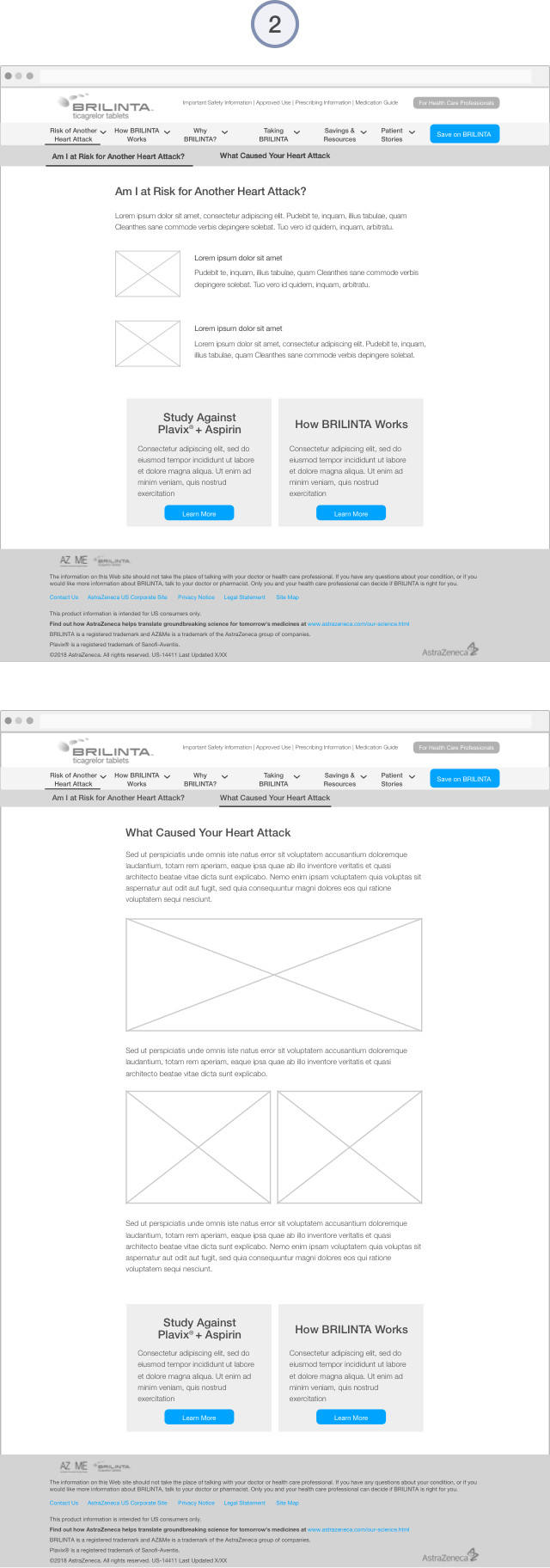
Content split among smaller child pages, which are reached through a sub-navigation that is always present in the header of the page.
Although it requires more clicks, the content presented is clearly defined and require little scrolling and searching by the user.
On desktop, I used a standard dropdown navigation pattern, keeping the global options in the header and revealing the sub-sections on mouse hover. Mobile navigation uses a hamburger menu that was always available in the header. In addition to a standard accordion style menu, I also designed a more dynamic option. The top of the menu highlights the three content sections that are most important to users with buttons above the content menu. These sections would be chosen based on user traffic, displaying the three that were most visited by users. If traffic changed over time, so would these buttons.


User Interviews & Testing
Once we received client approval on the wireframes, we conducted 30-minute, one-on-one remote user test sessions with six patients & caregivers over the phone. Our goal was to test our different page layout and navigation options and see if testers had any preference.
Using desktop and mobile prototypes, users were asked to complete a series of five tasks (e.g. “starting from the home page, how would you find study results for BRILINTA?”). They shared their screens with the team, so we were able to watch them complete the tasks. Users were pleased with the overall experience. They had few problems completing the tasks, crediting the clear calls to action on all of the home page concepts and the straightforward and easy to understand navigation titles.
Users strongly preferred smaller child pages for the content pages. They said that when they were doing treatment research, they were usually looking for answers to specific questions, so drilling down to a page with the exact piece of info was better than having to scan a longer one. They didn't want to have to scan the page looking for the content they needed and were likely to give up if they didn't find it quickly.
The dynamic mobile menu concept proved to be popular with users, as they appreciated the subtle guidance of quickly seeing the most popular pages. Unfortunately, due to technical and budget restrictions with the client, the feature was unable to be implemented.
Results
The feedback that we received from users was implemented into the finalized wireframes and eventually the final design. The site launched in late 2018 and has been well-received by users.
Personally, this project was a good learning moment. Early in the design process, I was skeptical that a concept based on numerous child pages would be successful. Long scrolling pages have become fashionable over the past few years and I felt that it was in line with the focus on readability and scannability I wanted for the site. Only after seeing the user feedback did I realize that new trends aren’t always the right solution.